

Data journalist portfolio
Turning data into clear analytical research, interactive reports and visual stories.
Analytics and storytelling
Periodic table of AI startups – 14 company categories
Classification of 305 AI startups that raised funding between February 2025 and February 2026 by funding, count, annual growth, momentum trend, and ecosystem.
|Web scraping| • |Python| • |Tableau|
|Web scraping| • |Python| • |Tableau|
Funding and outcomes analysis of 100,000 startups
A study of model data for predicting IPO, acquisition, or shutdown outcomes. The approach and data structure used are identifying the true drivers of startup success and failure.
|Python| • |SQL| • |Tableau|
|Python| • |SQL| • |Tableau|
25-year risk-return analysis of investment portfolios
Risk and return are directly related: the higher an asset's potential profit, the higher the probability of financial loss. Safe instruments deliver minimal returns.
|OSINT| • |Python| • |Tableau|
|OSINT| • |Python| • |Tableau|
Who bought U.S. oil & products in 2025
A detailed analysis of U.S. Energy Information Administration data on U.S. exports of crude oil and petroleum products, broken down by country and region.
|Claude| • |Python| • |Tableau|
|Claude| • |Python| • |Tableau|
Housing bubble risk in major cities around the world
A 'bubble' is a substantial overvaluation of an asset, which can only be confirmed in hindsight. For asset managers and retail investors, such rankings serve as a warning sign.
|OSINT| • |CSV| • |Tableau|
|OSINT| • |CSV| • |Tableau|
Investment portfolio #1 - best US companies
An opportunity to buy stocks of IT, biotech, technology, and other fast-growing US companies. Limited risks with a high probability of achieving return targets.
|Google Sheets| • |JavaScript| • |Everviz|
|Google Sheets| • |JavaScript| • |Everviz|
Data visualization
Project Details & Insights
Goal:
- Visualize the results of the Barron's Spring 2026 Big Money Poll of U.S. professional investors to analyze their market sentiment and investment preferences
- Analyze the sentiment of portfolio managers and investment strategists toward U.S. and global equity markets
- Show the distribution of investment preferences across sectors, asset classes, and international markets
- Present investor forecasts for key economic metrics: inflation, Fed rate, Treasury yields, and GDP growth
- Collecting and preprocessing survey data from 105 professional asset managers
- Developing visualizations in Tableau
- Creating informational annotations, interactive highlights, and tooltips
- Publishing and presenting the dashboard ⧉
- Interactive Tableau dashboard with four thematic tabs: Markets, Assets, Equity, Economy
- Navigation system for switching between a global market overview and detailed analysis of individual asset classes and sectors
- Recorded a rise in optimism among professional investors: the share of bulls increased from 47% to 54%
- Identified the most attractive sectors: Energy (24%), IT (17%), and Industrials (15%)
- Determined asset class leaders: the strongest bullish sentiment was recorded for Commodities (75%) and non-U.S. equities (66%)
- The tool enables investors and analysts to quickly assess shifts in market sentiment and adjust investment strategies accordingly

Project Details & Insights
Goal:
- Visualize global shifts in U.S. crude oil and petroleum exports in 2025, highlighting key changes in trade partners and regional market shares
- Analyze import volume dynamics across the world’s major economies
- Clearly illustrate the redistribution of energy flows (e.g., the rise of India and the Netherlands against China’s declining share)
- Provide a tool for Year-over-Year (2024 vs. 2025) comparison by country and region
- Data preprocessing and energy shipment analysis using Python
- Generating special dataset with Claude
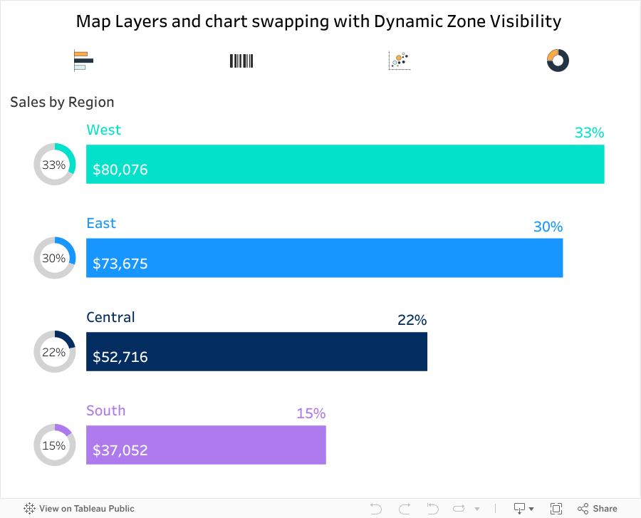
- Developing spatial visualizations using Map Layers in Tableau
- Configuring dynamic comparison elements to track market trends and growth rates
- Designing the UI in a Visual Capitalist-style infographic format for maximum readability
- Publishing and presenting the dashboard ⧉
- An interactive Tableau dashboard combining geographic mapping with detailed growth/decline charts
- A navigation system allowing users to toggle between global overviews and deep dives into specific markets (Netherlands, Mexico, China, etc.)
- Identified the Netherlands (Port of Rotterdam) as Europe's primary energy hub in 2025 (419M barrels)
- Captured a sharp 25% decrease in China’s reliance on U.S. oil, contrasted by a 35% surge in Indian imports.
- Highlighted Canada’s infrastructure-driven dependence on U.S. imports despite its own vast reserves
- Provided a high-level tool for investors and analysts to quickly assess geopolitical risks in the energy sector

Project Details & Insights
Goal:
- To identify the factors that most significantly influence the success or failure of startups
- Detect nonlinear relationships between numerical and categorical metrics that standard Pearson correlation fails to capture
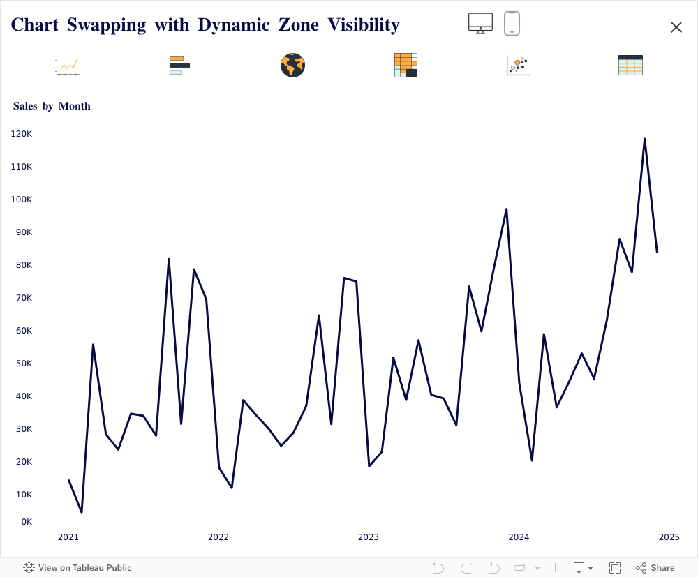
- Provide users with a tool for conducting their own in-depth analysis of the distribution of results
- Calculating the Phik correlation matrix in Python to uncover nonlinear relationships
- Designing a PostgreSQL → Tableau data model
- Configuring a filtering and navigation panel using Dynamic Zone Visibility
- Creating explanatory notes, interactive highlights, and tooltips
- Publishing and presenting the dashboard ⧉
- Interactive dashboard in Tableau, integrated with PostgreSQL
- Navigation system for data exploration and drill-down into any metric
- Quantified venture risks through dependency analysis
- Identified critical metrics for strategy optimization
- Uncovered underperforming projects based on early indicators
- Projected a 20-30% increase in venture portfolio ROI

Project Details & Insights
Goal:
- To visualize the AI startup landscape and identify investment trends across 14 market categories for the period from February 2025 to February 2026
- Present 305 startups in a structured format while preserving 5 key parameters for each category
- Enable users to independently compare categories by funding volume, growth dynamics, and market trend
- Provide quick access to specific companies and market facts through interactive tooltips
- Adapting the Veridion external classification as a data source
- Designing a visual layout in periodic table format
- Placing parameters using Map Layers: investment ranking, market trend, annual growth, funding volume, number of companies
- Configuring tooltips with startup examples and analytical facts for each category
- Publishing and presenting the dashboard ⧉
- Interactive Tableau dashboard with a periodic table layout
- Navigation across five parameters through visual element placement
- Tooltips and bar charts as a second level of detail
- Visualized 14 AI market categories on a single screen
- Identified growth leaders: AI for Developers (+320%), AI Agents (+260%), and Vertical SaaS (+250%)
- Captured the market shift from general-purpose AI to sector-specific solutions
- Delivered a ready-to-use tool for initial screening of AI investment trends

Project Details & Insights
Goal:
- To visualize the risk-return relationship of asset classes and model investment portfolios based on 25 years of historical data (2001–2025)
- Illustrate the behavior of individual assets and diversified portfolios on the risk-return scatter plot
- Enable users to evaluate annual returns for any portfolio or asset over a selected period
- Provide filters by analysis period and asset classes
- Implement a "Quadrant View" mode to categorize portfolios based on target return and risk tolerance
- Collecting and calculating 25 years of historical data on asset returns in USD
- Creating a scatter plot with three types of objects: diamonds (asset classes), lines (portfolios of two assets), and grey dots (portfolios of three assets in 5% increments)
- Developing tooltips showing annual returns for each point and diamond
- Integrating filters by analysis period and asset classes
- Configuring Dynamic Zone Visibility for "Quadrant View" mode: when enabled, additional filters for target return and risk tolerance appear
- Publishing and presenting the dashboard ⧉
- An interactive Tableau dashboard based on a scatter plot with three levels of portfolio detail
- Visual tooltips showing annual returns as a second level of analysis for any point
- "Quadrant View" mode with dynamically appearing filters to assess portfolio relevance based on the investor's specified parameters
- Empirically validated the fundamental risk-return tradeoff using 25 years of real-world data
- Demonstrated the diversification effect, visually showing how two- and three-asset portfolios shift toward an optimized risk-return profile
- Built a dedicated tool for selecting model portfolios tailored to individual investor risk profiles
- Established a foundational framework for client advisory work on asset allocation


Project Details & Insights
Goal:
- To evaluate the effectiveness of ad placement filtering in the Yandex Advertising Network
- Compare the trends in key metrics before and after ad placement filtering
- Visualize the distribution of metrics by device type and ad placement quality
- Set up monitoring of filtering effectiveness with weekly updates
- Preparing and cleaning advertising campaign data from Yandex.Direct
- Designing a dashboard by device type (desktop, mobile, tablet) and ad placement type
- Configuring interactive highlights
- Customizing filters by ad placement, detail, and time period
- Publishing and presenting the dashboard ⧉
- An interactive dashboard in Tableau for monitoring the effectiveness of ad placement filtering by device and platform
- A system of highlights by device type as a tool for quick comparison of segments
- Cross-filters for independent analysis of combinations of platforms and periods
- Validated the necessity of placement filtering, as irrelevant platforms lower ROAS
- Created a dedicated tool for regular ad placement audits
- Established a methodology requiring blocklist moderation at least twice a year
- Recommended allocating 10-15% of the budget to continuous mobile placement testing, given their high ROAS potential

Contacts
Alexander Slobodskoi
Data journalist
Hello!
I turn complex datasets into in-depth analytical research, interactive special projects, and useful info-products.
My focus is on creating data-driven content for media, fintech companies, and consultancies: finding hidden trends in numbers, testing hypotheses, and packaging dry statistics into engaging visual stories. I also translate complex technical language and convoluted reports into a format that's clear for business audiences and the general public.
Key competencies:
- Sources and OSINT: searching for information in open and commercial sources, government registries, agency databases, and auditing methodology to eliminate errors.
- Data collection and analysis: using Python and SQL for automated data collection (web scraping, APIs), cleaning "dirty" datasets, and conducting statistical research.
- Interactive visualization: designing clear charts, interactive maps, and analytical dashboards.
- Data storytelling and distribution: the full cycle of content creation - from formulating a hypothesis and finding a news hook to creating, promoting, and monetizing analytical content.
Currently looking for new opportunities to apply my experience in media projects, corporate research, and content marketing.
The materials presented in this section are not individual investment recommendations. The financial instruments mentioned in this section may not be suitable for you and may not correspond to your investment profile, financial situation, investment experience, knowledge, investment objectives, or attitude toward risk and return.
This information does not constitute a public offer, proposal, or invitation to invest in funds and/or strategies, or to buy or sell securities, or to enter into transactions with them.
Past investment performance does not determine future returns. This is not an advertisement for securities. Before making an investment decision, the investor must independently assess the economic risks and benefits, as well as the tax, legal, and accounting consequences of the transaction, and their willingness and ability to accept such risks.
© 2016—2026 Invest Adviser
This information does not constitute a public offer, proposal, or invitation to invest in funds and/or strategies, or to buy or sell securities, or to enter into transactions with them.
Past investment performance does not determine future returns. This is not an advertisement for securities. Before making an investment decision, the investor must independently assess the economic risks and benefits, as well as the tax, legal, and accounting consequences of the transaction, and their willingness and ability to accept such risks.
© 2016—2026 Invest Adviser
Manage cookies
Cookie Settings
Cookies necessary for the correct operation of the site are always enabled.
Other cookies are configurable.
Other cookies are configurable.